ACϟDC TEQUILA PACKAGE DESIGN
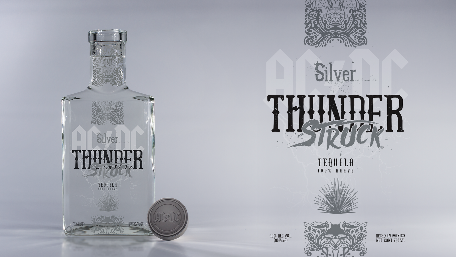
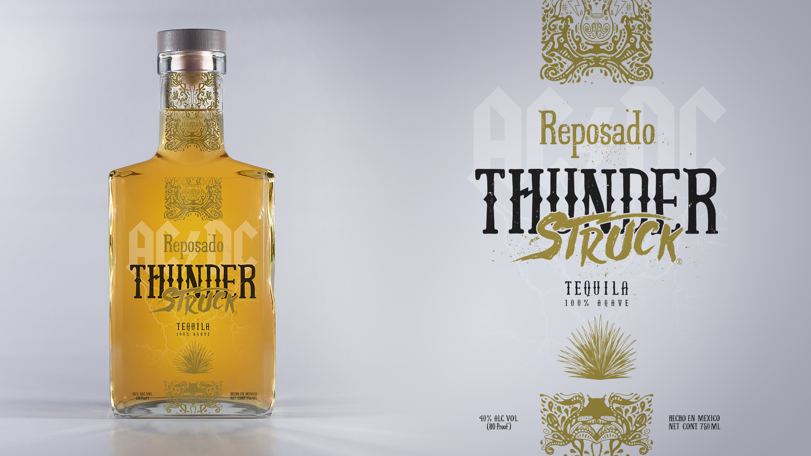
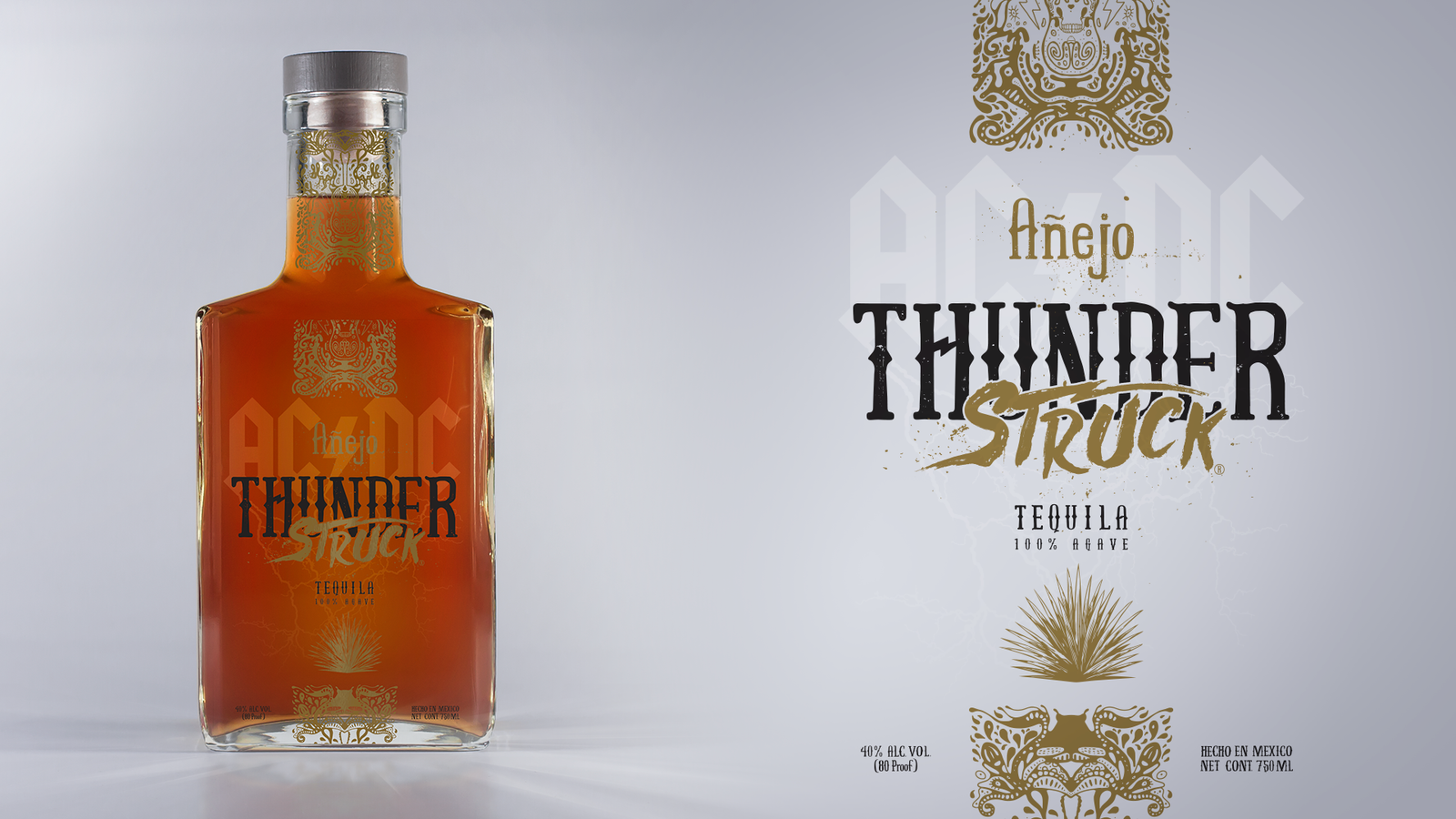
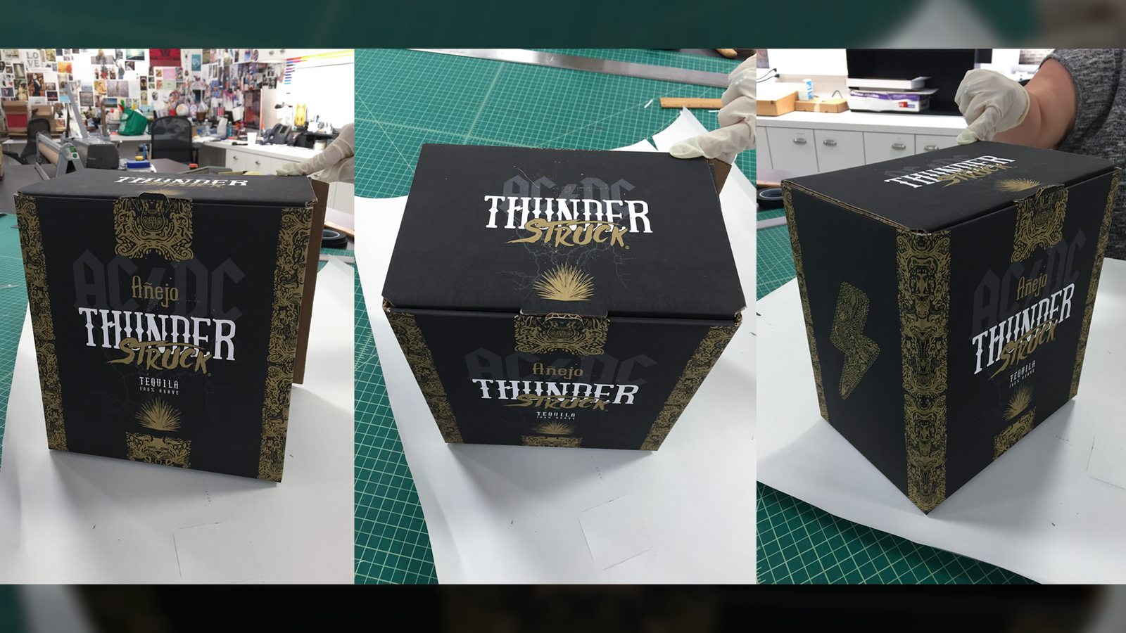
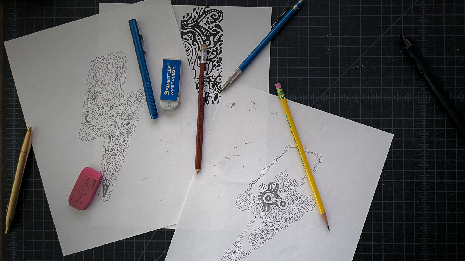
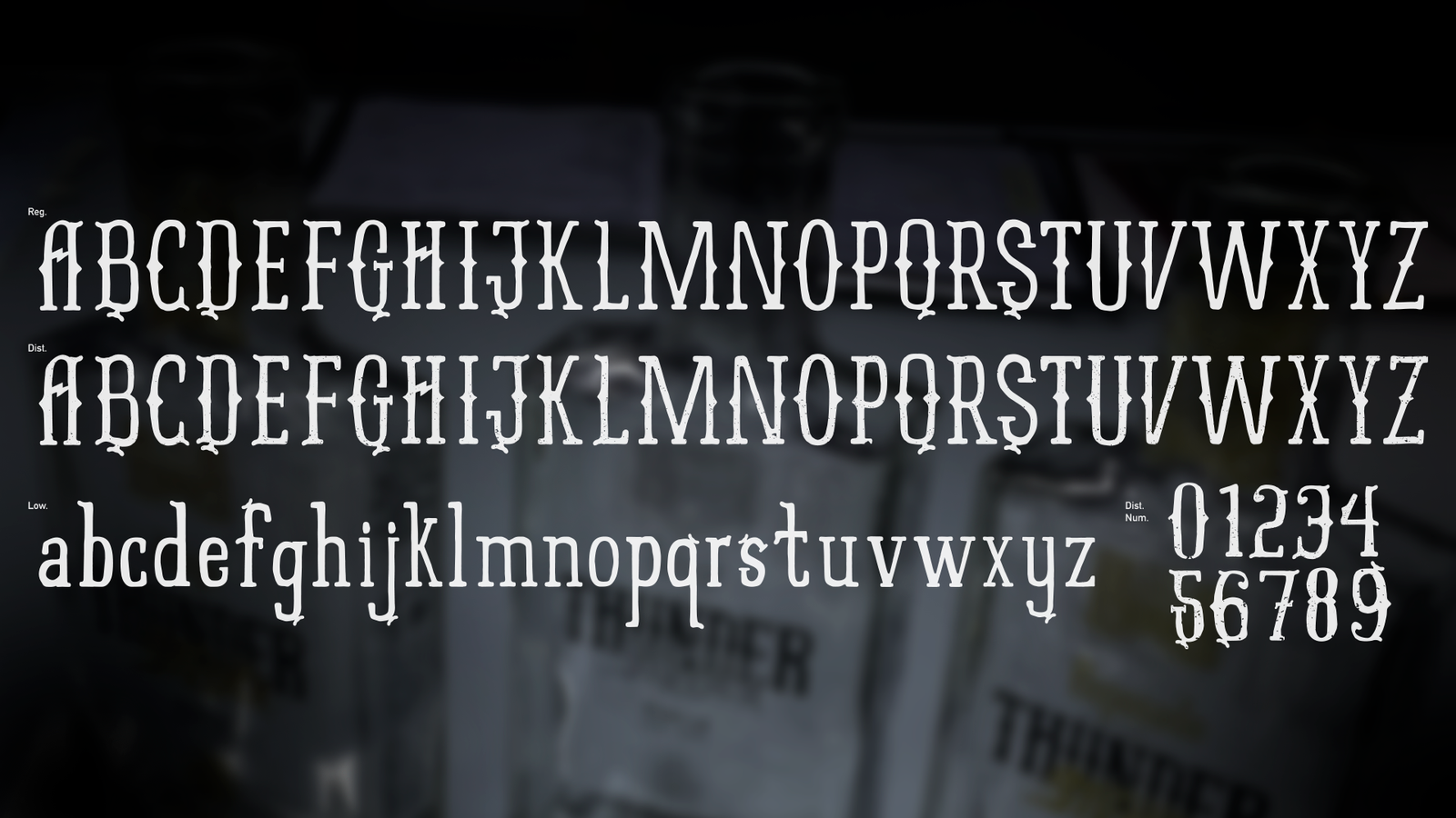
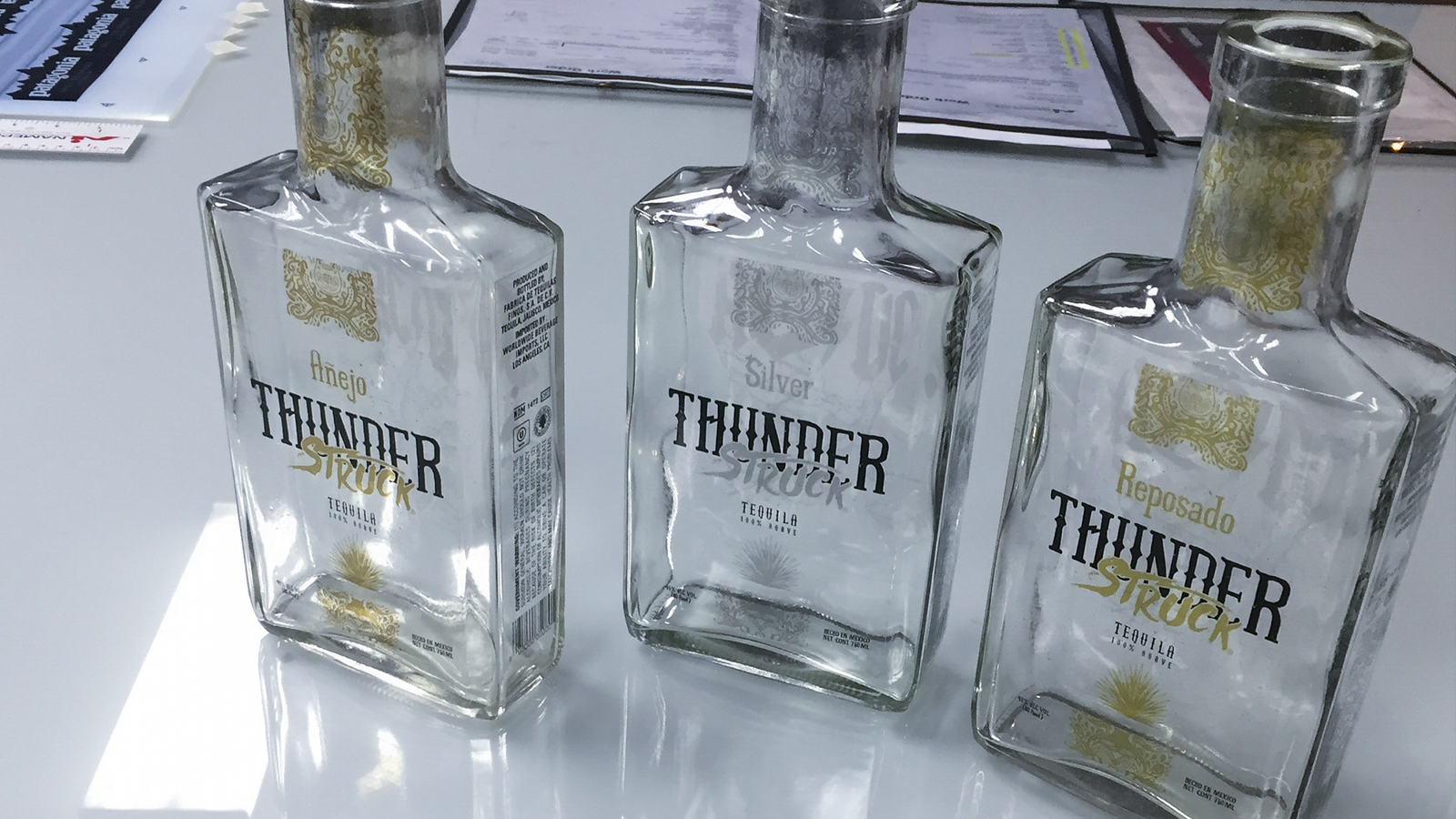
The goal, to not create something that was seen as “cheesy as fuck”. Keep it upscale and stay away from those ridiculous stereotypical rock band motifs. The design process was crafted by hand, a custom distressed typeface was created, the illustration was pencil to paper. Which carries a simple balance between Mexican folk art aesthetics and musical symbolisms. A sense of depth was created by using the back of the bottle to house the bands logo and lightning strikes, making it a multi-dimensional design. A bit of pearlescent and foil stamping print techniques were also used to evoke premium-ness.
ROLE ≈ VISUAL DESIGNER / ILLUSTRATOR / TYPOGRAPHER CLIENT ≈ STOLI GROUP SHINY STUFF ≈ GRAPHIS / LÜRZER’S ARCHIVE – 200 BEST: PACKAGING DESIGN WORLDWIDE

